Shapefiles: Area maps, network links, and GeoJSON
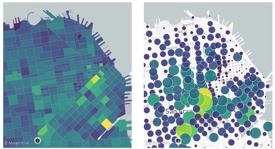 (1) Area map with "choropleth" color-filled areas; (2) Area map with circles instead of filled areas
Area maps with filled colors are excellent for depicting spatial data in one dimension.
NOTE Both plots are created using the same configuration below. Click the UI button below the maps to switch between the two views.
Creating this panel
Properties are written in either a standalone viz-map*.yaml file, or in a dashboard file they go in the layout: section of a dashboard-*.yaml file. See the examples at the end of this document.
Standalone: Create a viz-map*.yaml file as described below
-or-
Embed in Dashboard: Create a dashboard-*.yaml file and include a type: map section as described below.
- Each area map panel is defined inside a row in a
dashboard-*.yamlfile. - Use panel
type: mapin the dashboard configuration. (Note this may change in the future as we add more map types) - Standard title, description, and width fields define the frame.
- See Dashboard documentation for general tips on creating dashboard configurations.
The SimWrapper example project includes sample data and YAML configurations that you can use as a starting point.
Properties
Dashboard panel properties
| Property | Usage |
|---|---|
type | MUST be set to "map" in dashboard-*.yaml config files |
height | Relative height. Larger numbers create taller panels. (default: 5) |
width | Relative width. The widths of all panels on a single row are summed, and the layout of each panel is then relative to that total width. (default: 1) |
General properties
| Property | Usage |
|---|---|
title, title_en, title_de | Title text for this panel; will be shown just above the map. The language-specific version will be used if provided. |
description, description_en, description_de | Second line of descriptive text, shown below the title line. The language-specific version will be used if provided. |
center | Coordinates that the map centers on. Can be provided as array or string. If it is not provided, a center is calculated using a sampling of the data. |
zoom | Zoom level of the map between 5 and 20. (default: 9) |
pitch | Map pitch (default: 0) |
bearing | Map bearing/direction (default:0) |
mapIsIndependent | Allow this map to have its own map/center/motion independent from other maps on the same dashboard. (default: false) |
"shapes:" the features (links, areas, etc) to be drawn
shapes:
  file: my-taz-shapefile.shp
  join: id
  keep: AB,LENGTH,TAZ,SQMILES
There are two separate input types required for a shapefile/geojson map: (1) the boundaries or shapes themselves, which can be geojson or shapefile format; and (2) additional datasets in CSV/DBF tabular format which contain columns of data that can be attached to the features. These datasets are optional, if the shapefile self-contains all of the required data.
All inputs must contain an identification column in order to join the datasets together. In other words, the feature IDs must be present in both datafiles. The names of the columns do not have to be identical, but it helps legibility. See below.
shapes section can have the following properties:
| Property | Usage |
|---|---|
file | String. The filepath of the feature dataset. May include wildcards * and ?. File can be in geojson format, or a shapefile. File type is determined by the filename extension, which must end in either .geojson or .shp When loading shapefiles, an identically-named .dbf and .prj file will also be read from the same folder. Be sure to supply a .prj file containing a valid EPSG code if your data is not in lat/long format! |
join | String. The name of the property containing unique shape IDs, or set to id if it is in the id field of the geojson itself. |
keep | String (optional). Comma-separated list of fields to KEEP in memory from the shapefile properties. Some files are very large with many properties that you are not interested in. Use the keep property to list the only ones you actually need, in order to save memory and improve performance. If keep is not specified then all properties are retained. |
datasets: datasets to be joined to the features
datasets:
  population: "../pop/2025/population.csv"
  transit-trips:
    file: .summaries/transit-outputs.csv
    drop: bike,ped,MTCTAZ
    keep: TAZ,TIME,pm_vol,orig,dest
datasets: defines any additional tabular datasets that are linked to the feature dataset from above. Every dataset is defined by a short keyword name followed by a colon, and then the needed properties are provided. In the example above, population and transit-trips keywords are defined. Use the keyword to refer to the dataset when defining colors and widths (see below).
- In simple cases a filename can be given directly, as in the
populationexample above. - Other properties can be defined to keep/drop certain columns, as in
transit-trips.
name of dataset: Give the dataset a simple name, which will be used in the display settings below. e.g. tazdata:
Each subsection can have the following properties:
| Property | Usage |
|---|---|
file | String. The filepath containing the data. May include wildcards * and ?. File can be in CSV or DBF format. Any filename not ending in .dbf will be parsed as a CSV file, using either commas, tabs, or spaces as delimiters. |
drop | String (optional). Comma-separated list of column names to be dropped from memory; these columns will be unavailable to this visualization. This can save memory and improve performance. |
keep | String (optional). Comma-separated list of column names to be kept in memory for this visualization. This can save memory and improve performance. |
display: define the symbology details: colors, widths, etc
display:
  fill:
    dataset: transit-trips
    join: TAZ
    filters: operator, income
    columnName: trip_origins, trip_boards, trip_reslocs
    colorRamp:
      ramp: Plasma
      reversed: true
      steps: 5
The display section is where you define the details of your map symbology: the line and fill colors, line widths, circle radii, difference calculations, and so on.
Different map types allow different properties. This is an attempt at summarizing the capabilities; not all combinations work for every map type. There are many, many configuration options listed here, and they mimic the user interface options available in the configuration panel.
Instead of trying to write this YAML from scratch, try creating a map interactively on the SimWrapper site, and then choosing EXPORT from the configuration panel. SimWrapper will produce a YAML file with most/all of your settings and save it in your browser's Downloads folder. You can move this to your data folder and modify as necessary.
| Property | Usage |
|---|---|
dataset | Name of the dataset from above which includes the data. |
columnName | The column name (or names) containing values to be plotted. If multiple rows have a matching shape ID, all values will be summed together. |
colorRamp | Describe the colors to be used: ramp: Name of the color ramp to use. Sequential: Viridis Plasma Blues Greens Purples OrangesDiverging: PRGn RdBuCategorical: Tableau10 Paired. Note categoricals only have ten or twelve categories. |
| reversed: true/false | |
| steps: Number of steps in the ramp. | |
| exponentColors: Optional true/false. If true, values will be scaled exponentially before being drawn. This is often useful if values are concentrated in small areas, and much higher in value than in typical areas. | |
diff: Example col1 - col2 will activate diff mode | |
relative: When using diff mode, set relative to true to calculate the percent change instead of the raw difference. So when true it would be (col2-col1)/col1 | |
breakpoints: Comma-separated list of manual breakpoints for data values. Example: set steps: 5 and set breakpoints: -10,-1,1,10 with a diverging color scale to see large and small difference easily. Remember, math requires one less breakpoint value than the number of steps! | |
fixedColors | If you want to manually select colors instead of using the prebuilt color "ramps", create an array of strings for each color. The array must have the same number of elements as the colorRamp: steps. Example: fixedColors: ['firebrick','salmon','silver','dodgerblue','blue'] Any valid CSS color can be used; see the CSS color names or use CSS color hex codes e.g. '#f00' for red.Do not include a ramp in the colorRamp section, it will be ignored. |
filters
filters:
   dataset1.trips: "> 0"
   shapes.TAZ: "!=0"
In the filter section, you can filter dataset with multiple expressions on numerical columns in any dataset. Keys are of the format dataset.column: "filter" and filter can be ==, !=, <, <=, >, >=
More filter examples needed!
Tooltip
tooltip:
  - shapes.FACILITY_TYPE # "shapes" always refers to the shapefile/network/features
  - shapes.SPEED
  - am_assign.TOT_VOL
  - am_assign:BIKE
By default, the tooltip shows all columns in the featureset/shapefile, as well as any columns that are actively being displayed as either a color or a width.
You can customize the tooltip to just show what you are interested as follows:
- Add a
tooltip:section to the properties, which will be an array of tooltip entries - Each entry is of format
dataset.columnname, so for exampleAM_FLOWS.VEHICLE_VOLwill display the AM_FLOWS dataset and VEHICLE_VOL column. - Use
shapes:...for the shapefile/network data, or the dataset "key" for joined datasets.
Difference plots
Comparing a base vs. build, project vs. no-project, or scenari A vs. B, is a common need in both network link and area plots. The method for difference plots is the same for both.
Diffs in the UI
- From the config panel, add two datasets such as a base and a build CSV.
- You can now go into the
ColorWidthpanels for your lines or areas to set up the diff. - Make sure you have the
Join Byselected properly; the id field for each dataset must link to the shape IDs correctly - With two datasets loaded, the
Compare datasetsdropdown allows you to choose A-B or B-A. You can also select percent difference if desired (for colors) - For colors, be sure to choose a diverging color palette: one with a neutral central color and different colors to the left/right of center.
- Manual adjustments to color ramps and breakpoints can be edited in the resulting YAML file, see below.
Diffs in YAML config
As above, two datasets are needed to build a difference plot. The YAML for maps includes several fields relevant for diff plots, all in the relevant Width or Color sections.
- The
difffield references the two dataset names. - It is a string with the form
dataset1 - dataset2. - Example
diff: "project - base" - Be sure to set the
jointo identify the id fields properly - For colors choose a
divergingcolorramp. Valid diverging color ramps areRdBu,PrGn,RdYlBu. breakpoints:: It will auto-guess breakpoints but you can set your own with a comma-separated list of breakpoints. This list must be lengthsteps-1.- Example:
steps: 5andbreakpoints: -10,1,1,10has a neutral central area for values between -1 and 1.
- Example:
Example DIFF YAML fragment
shapes:
    file: "../shapefiles/freeflow.geojson"
    # keep: AB,FT,MTYPE,STREETNAME
    join: AB
datasets:
    base: "../2025_Baseline/daily_vols.dbf"
    build: "../2025_Project18th/daily_vols.dbf"
display:
    lineColor:
        diff: build - base
        columnName: DAILY_TOT
        join: AB
        colorRamp:
            ramp: RdBu
            # reverse: true
            steps: 9
            breakpoints: -1000, -500, -100, -10, 10, 100, 500, 1000
    lineWidth:
        diff: build - base
        columnName: DAILY_TOT
        join: AB
        scaleFactor: 100
Some visualization hints
Normalization
Very large and very small areas on the same maps can create misleading visualizations; consider "normalizing" data by land area before plotting it.
Color choices
- Use the sequential color palettes for continuous data.
- Use diverging color palettes for difference plots and other situations where data is both positive and negative
- Use categorical colors when there are just a few categories or "buckets" in which the data resides.
Example YAML configurations: putting it all together
Sample viz-map-1.yaml standalone configuration
title: 'VIZ-MAP 1'
description: 'All day transit usage'
center: [6.9814, 51.57]
zoom: 10
shapes:
  file: '../../shapefiles/geoid.geojson'
  join: id
datasets:
  transit-trips:
    file: .dashboard/transit-data.csv
display:
  fill:
    dataset: transit-trips
    join: geoid
    filters: operator, income
    columnName: trip_origins, trip_boards, trip_reslocs
    colorRamp:
      ramp: Plasma
      steps: 7
tooltip:
  - shapes.FACILITY_TYPE # "shapes" always refers to the shapefile/network/features
  - shapes.SPEED
  - transit-trips.passengers
Sample dashboard-1.yaml dashboard with an area map
header:
  title: 'Trip Destinations'
  description: 'All day'

layout:
  row1:
    - type: map
      title: 'VIZ-MAP 1'
      description: 'All day transit usage'
      height: 10
      center: [6.9814, 51.57]
      zoom: 10
      mapIsIndependent: true
      shapes:
        file: '../../shapefiles/geoid.geojson'
        join: id
      datasets:
        transit-trips:
          file: .dashboard/transit-data.csv
      display:
        fill:
          dataset: transit-trips
          join: geoid
          filters: operator, income
          columnName: trip_origins, trip_boards, trip_reslocs
          colorRamp:
            ramp: Plasma
            steps: 7
      tooltip:
        - shapes.FACILITY_TYPE
        - shapes.DISTRICT
        - transit-trips.passengers