
Scatter plots
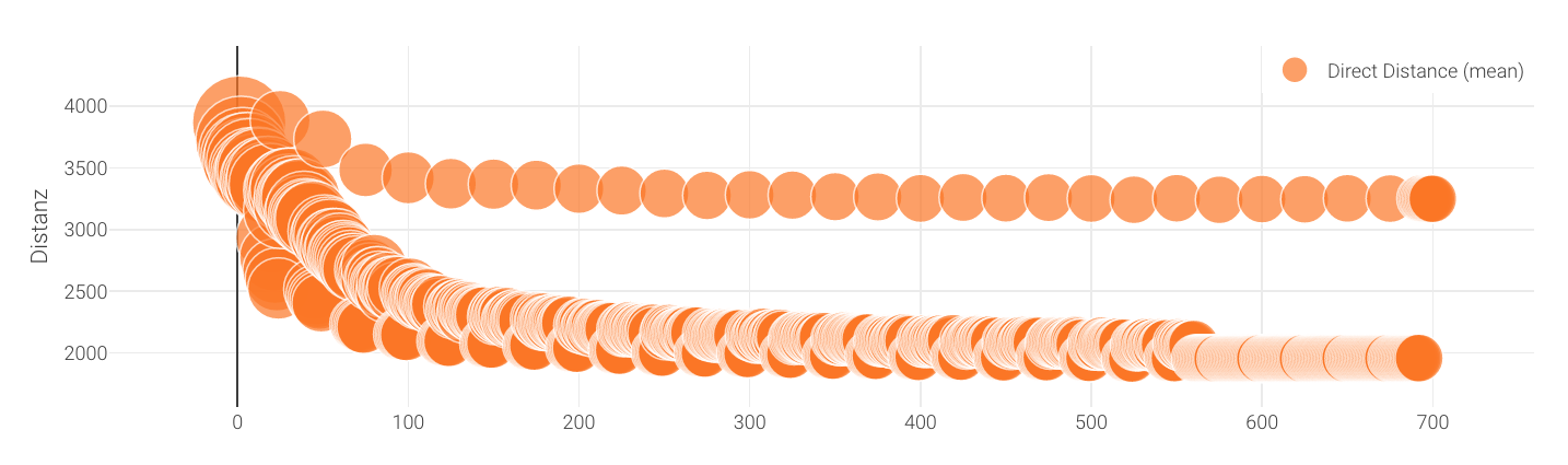 A "bubble" plot, a type of scatterplot where the circle sizes are variable
Scatterplots and bubble plots allow you to plot data on two independent axes.
Usage
Scatterplots can only be included as panels in Dashboards. See Dashboard documentation for general tips on creating dashboard configurations.
- Each chart panel is defined inside a row in a
dashboard-*.yamlfile. - Choose from panel types
scatterandbubblein the dashboard configuration. - Standard title, description, and width fields define the frame.
Sample dashboard.yaml config snippet
layout:
  row1:
    - type: 'scatter'
      title: 'Y vs. X'
      description: 'a scatterplot'
      width: 3
      dataset: '*drt_customer_stats.csv'
      x: 'iteration'
      usedCol: [distance]
      legendName: ['Distance (mean)']
      xAxisName: 'Iteration'
      yAxisName: 'Distance, m'
      markerSize: 5

    - type: 'bubble'
      title: 'Y vs. X'
      description: 'a bubbley scatterplot'
      width: 2
      dataset: '*drt_customer_stats.csv'
      x: 'iteration'
      y: 'distance_mean'
      bubble: 'directDistance'
      factor: 100
      legendName: ['Distance (mean)']
      markerSize: 5
      skipFirstRow: false
      xAxisName: 'Iteration'
      yAxisName: 'Distance, m'
Scatterplot and bubbleplot properties
dataset: (Required) String. The filepath containing the data. May include wildcards * and ?.
x: String. The column containing x-values.
y: String. The column containing y-values.
bubble: String. The column containing bubble size values.
legendName: Array of strings. Legend titles for each line. The column names will be used if this is omitted.
xAxisName/yAxisName: Labels for the axes.